TRAVEL PALETTE
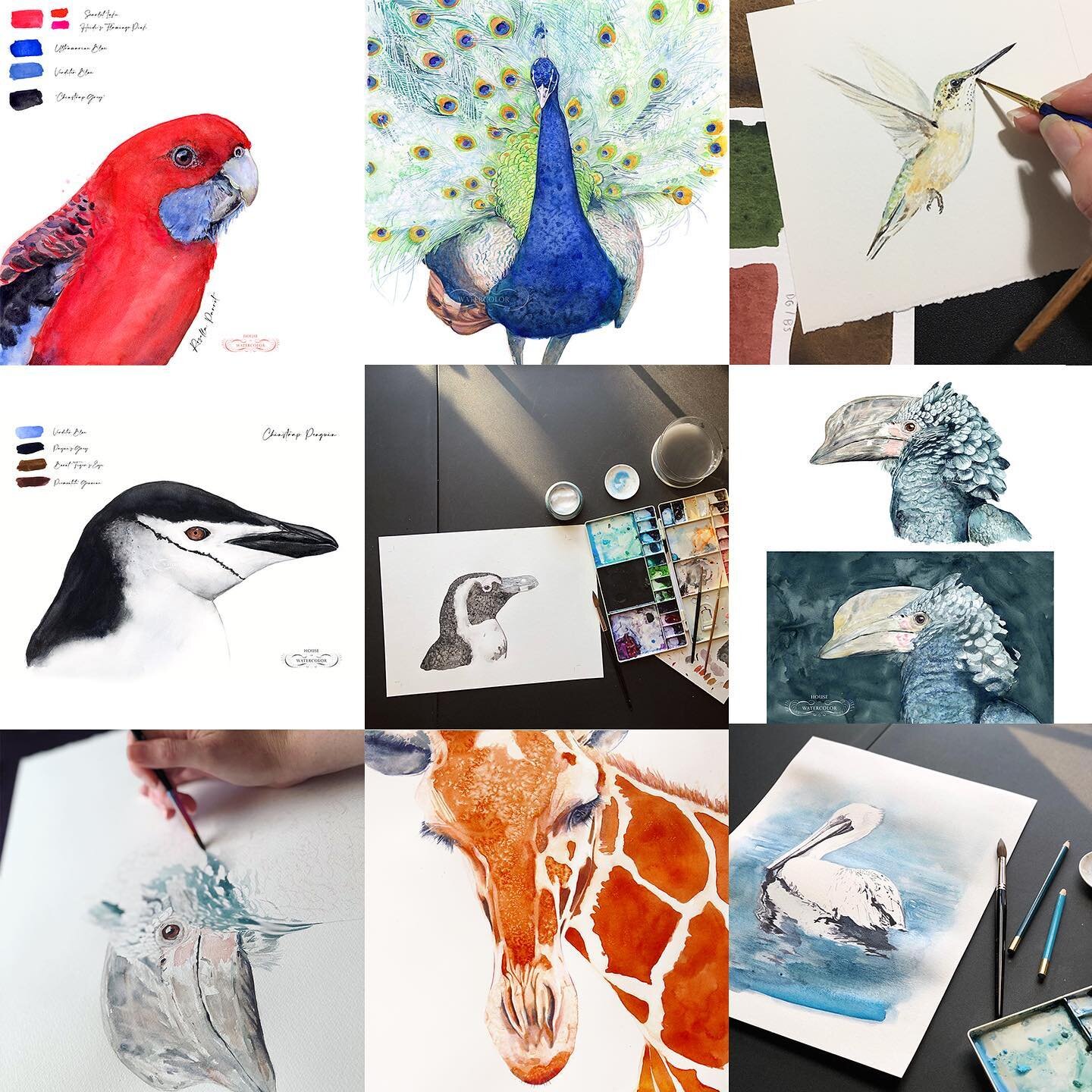
Jane Blundell’s ultimate mixing palette is a great place to start! I choose colors for my palettes based on personal taste and subject matter. For example, the collection of pigments I use for pet portraits have specific characteristics (such as granulation) which help me create the texture of fur. But when I paint birds, I seek out non-granulating and vibrant pigments.
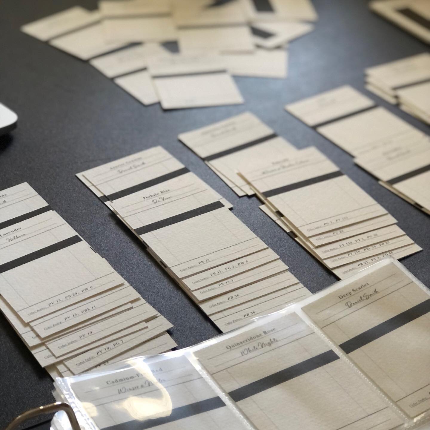
If you are putting together a plein air palette for painting landscapes, then you will want colors that provide a full-range of color mixing possibilities. This is important because if you are out on the beach and the sunset shifts to a purple, you will want to make sure you have colors that will make a pure purple to work with. It isn’t always as simple as mixing a blue with a red. Since the light will change colors quickly in nature, it helps to be VERY familiar with your palette of colors. Time spent putting a color chart together for reference is worth the effort and so helpful when you need to mix a color fast!
There are many ways to put a palette together, but there is no right or wrong way to do so. It all just depends on what you like and how you plan on using the palette.

Ideally, colors should work together with the other pigments in your palette when you mix them together, so choose colors which provide a wide range of mixing possibilities.
For me this begins with a selection of both warm and cool primary colors. This is the foundation for the rest of your color palette. In theory, primary colors (yellow, red, and blue) allow you to mix just about any other color you need. And having warm and cool versions is essential for mixing bright and intense secondary colors (orange, purple, and green).
This combination of warm and cool primaries is often referred to as a “split primary palette”. I advise starting with this kind of setup because it helps address some of the mixing limitations of primary paints so you can produce more vivid, saturated colors. The split primaries let you mix brighter colors by using paints that are closer together on the hue circle.
Choosing strongly saturated colors and single pigment paints can vastly increase your range of mixing possibilities. It’s impossible to mix bright colors if the hues in your palette are dull or if they contain several pigments in their ingredients (check the labels). This is why single pigment paints are highly sought by watercolorists.
That’s not to say that you shouldn’t include some of your favorite convenience colors in your watercolor palettes. Browns, and dark greys are some of the most popular choices, and you can also include some “ready to go” secondary colors(purples, oranges, and greens).
Convenience colors are those that you mix so frequently that you don’t want to mix them from scratch every time. These are known as convenience colors because they save you time and they provide a consistent color appearance, rather than trying to mix exactly the right green each time you run out of paint. “Sap Green” is a common example of a convenience color which is a mix of several pigments.
Learn to choose pigments not colors. Look at the labels on your watercolors to understand the pigments that are being used. Don’t be fooled by the fancy names. Different manufacturers often use different pigment ingredients for paints that have exactly the same name. For example a “Hooker’s green” from Winsor and Newton won’t contain the same pigments as Hooker’s Green from Daniel Smith.
As far as palettes go, the folding palette is a great one to start with if you are using tube paints. They are made by a number of companies (with either 20 or 28 well options) and are generally very inexpensive but hold a good amount of paint. As they fold over to close, they do not suit paints that contain honey as a humectant, as these don't actually 'dry' in the palette so would run everywhere. This is particularly true of the beautiful M.Graham paints, which are better kept upright. Some paints dry out so much that they will fall out of the palette. The best ones I have used are Daniel Smith and Da Vinci, but I have not tried every brand - many other brands have some great colour choices too. Have a look at handprint.com (http://www.handprint.com/HP/WCL/waterfs.html) for a very complete study of the paints that he tested extensively over a number of years.
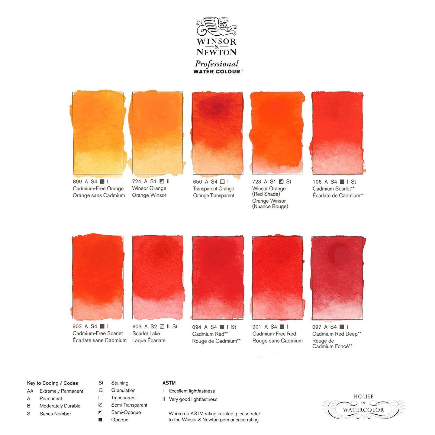
I have tried many hundreds of colours, some of which have made it into my general palette, many of which have not. Notice how close in hue (colour) many of them are, though different in characteristics - some granulating, some not, some opaque, some transparent. Choosing the right ones for your purposes is one of the many challenges, and one of the many joys of watercolour.
I have been asked what colours I use in my palette, so I will show it here, but keep in mind this is what suits me for what I paint, and deliberately includes some very granulating colours.
-JB